
Welcome back to the 14th edition of The Lab Report!
Either I was bad at taking notes, or there wasn’t much that happened this week.
But guess what, that gives us a chance to talk more about what web designers love most.
Can you guess what it is?
(P.S. this is a Wordle. I still don’t really understand why they’re all the rage or how it sold for over $1mil to the NY Times, but here we are.)
(P.P.S. in case you still didn’t get it, the answer is “tools” 🙂)
All games aside, let’s get into this week’s newsletter!
📨 Send your newsletters straight from WordPress
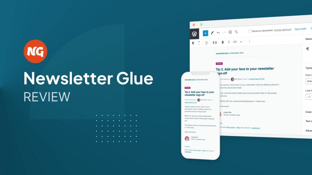
There are a couple tools I’ve started using this year that have been a great addition to my workflow. Newsletter Glue is one of them.
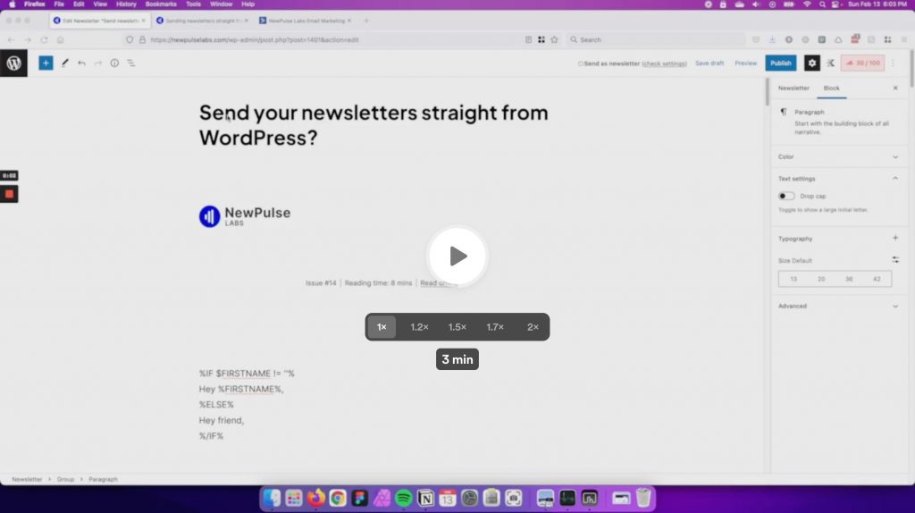
Sending out The Lab Report used to be a bit of a pain.
Because I want each issue to live on my website (for that SEO gravy), my workflow used to look like this:
Draft the newsletter in WordPress, make my edits, publish the post, and then create the whole newsletter again in ActiveCampaign.
With Newsletter Glue, I can do it all from Gutenberg now.
I basically just draft my newsletter in WordPress like I would a blog post, and then it automatically converts it into an email I can send out from ActiveCampaign.
I recorded a quick video in case you want to see behind-the-scenes:
It’s actually made writing the newsletter a lot more enjoyable since I don’t have to spend 1-2 hours each week fidgeting with formatting.
It’s not just for conventional newsletters either. I could see it being really useful if you want to send a weekly round-up of blog posts or send out your release notes.
If you want to read more of my thoughts on it, I wrote an in-depth review on Newsletter Glue here.
🧱 New Oxygen and Bricks updates
Oxygen released their first 4.0 beta this week, which means we’re getting one step closer to a stable release.
It mostly comes with bug fixes, but there are a couple tweaks that caught my eye.
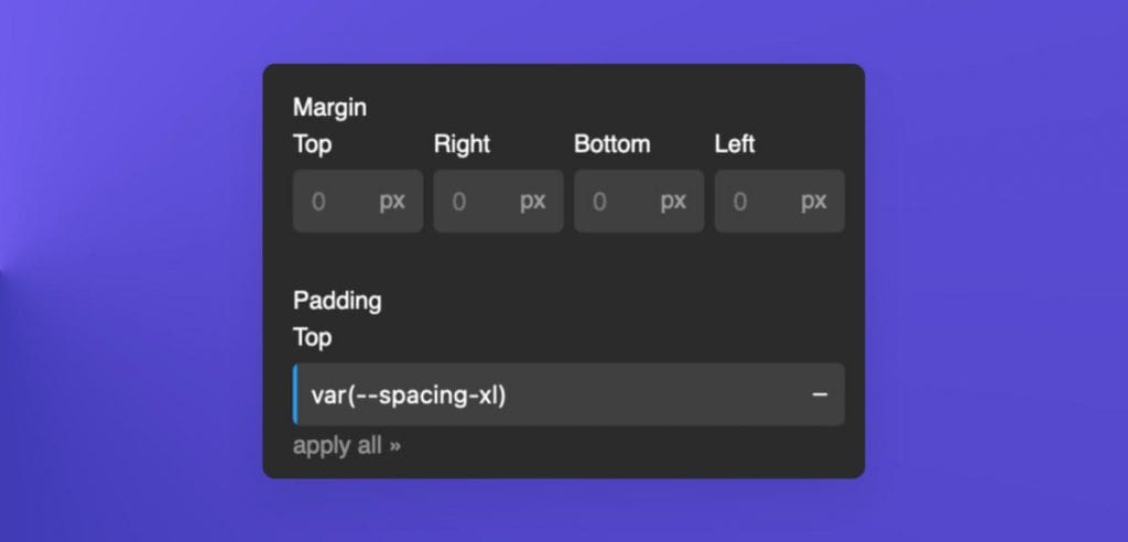
I’m not sure I love the new padding/margin controls (they’re not as visually intuitive), but I do love that they expand when using the “none” unit.
This makes using variables or clamp 100x better than it was before.
What are your thoughts on the new layout?
They also made some changes to the image element. You can add lazy loading and specify object-fit & position.
My favorite part is that they subtly changed the Media Library tab to come before Image URL tab now.
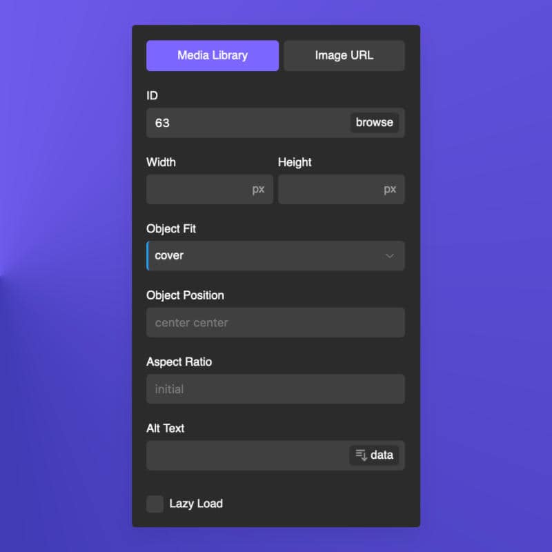
This saves me a click every almost time I add an image, and means I don’t need to do as much explaining to clients about how they’re using the image element wrong.
(In case you’re not aware, the main benefit of using Media Library is that it enables srcset. This means that you’ll get smaller image file sizes on mobile).
Switching over to Bricks…
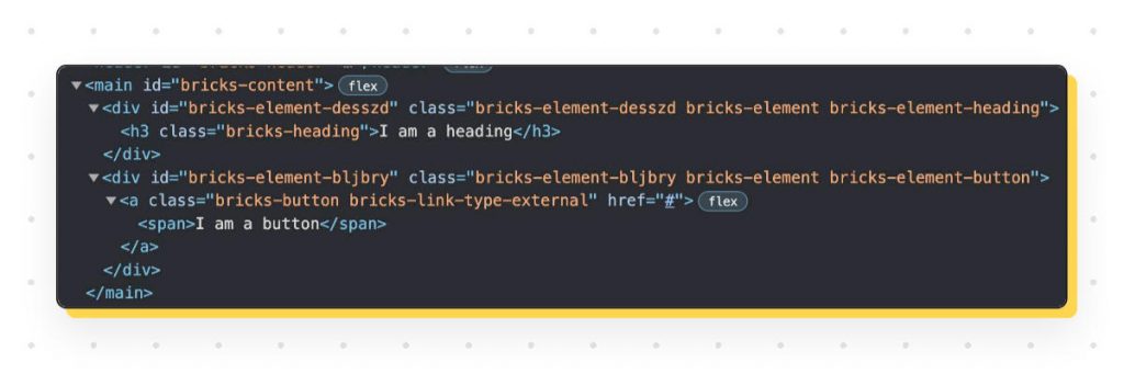
Bricks didn’t release an official update, but Thomas teased their new div structure.
They re-wrote all their render functions so there aren’t as many divs and wrappers now.
It was never as bad as some other builders, but every element can with an extra 1-2 wrappers.
The post had over 265 likes, so this is obviously something people care a lot about (as they should).
🔦 Untitled UI releases a lite version
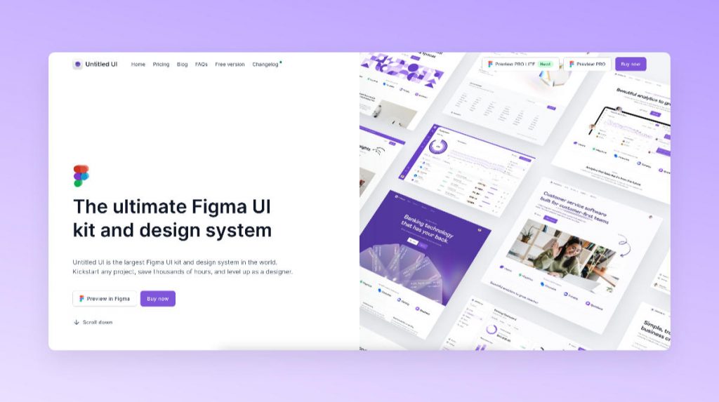
A couple of months ago I wrote a review on a massive UI kit called Untitled UI.
I’m not exaggerating when I say it’s massive. It has 10k components & variants, and is by far the biggest Figma file I’ve ever seen.
What was its greatest strength was also its greatest flaw though.
My new spec’d out MacBook handled it pretty well, but my old laptop did not.
I had to go in and start deleting the stuff I didn’t need to make it a bit more usable.
This week they released a LITE version that’s 50-70% lighter, which makes it a lot more accessible for most people.
At first glance I didn’t really notice much missing compared to the full version, so it looks like they did a good job of keeping the essentials while cutting the file size in half.
I’m actually currently in the process of setting it up as my NewPulse Labs design system. It’s so thorough and well-documented that even just using it has taught me a lot about how to use Figma like a ‘real designer.’
You can check out my full review on it here.
My blog post on the release is here.
🚀 Reduce your Cumulative Layout Shift (CLS)
If you’ve done any kind of speed optimization over the past couple years, you’re probably familiar with Cumulative Layout Shift (CLS).
It’s one of the metrics from Google’s Core Web Vitals that measures unexpected layout shifts, like an image pushing your text down, an icon that shifts your nav menu etc.
If you run your site through PageSpeed Insights, you might find that it isn’t scoring too well.
But how do you know what’s causing your page to shift around?
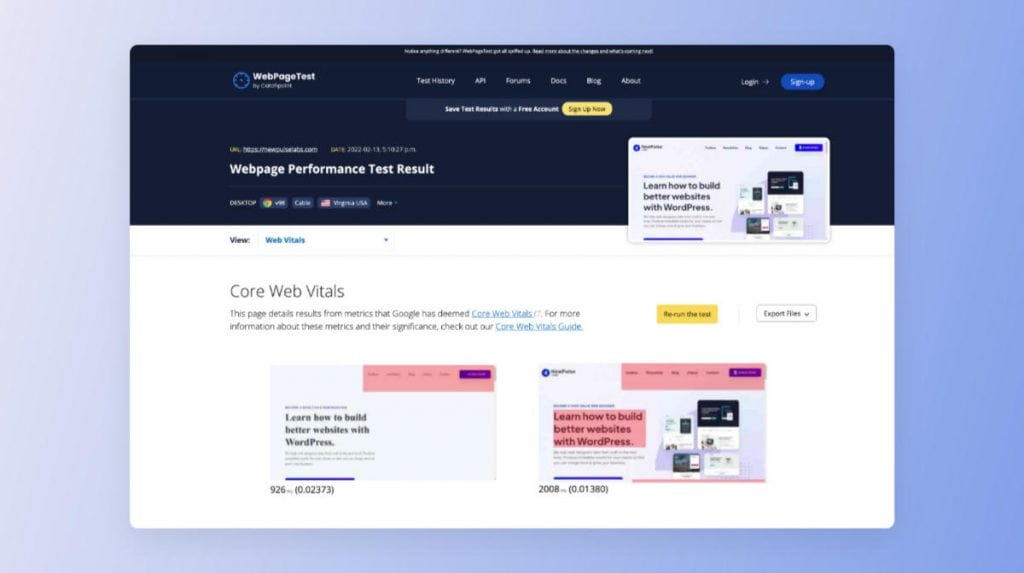
My favorite way to check is using WebPageTest’s Core Vitals test.
It shows a filmstrip view of how your page is loading, and also creates a .gif so you can see exactly what’s moving around.
There’s also this CLS gif generator if you’re looking for something more lightweight.
Super handy!
💬 Closing Comments
That’s all for this week. Hopefully you enjoyed the newsletter!
If you ever want to discuss any of these topics, I post a dedicated thread each week inside of the NewPulse Labs Facebook group.
You can also suggest any topics you think I should cover there, so be sure to join 🙂
Stay warm and talk soon.