If you’re a web designer who builds your projects from scratch, you’ll know how difficult it is to find a UI kit that’s actually usable.
I get excited every time I come across a fancy sales page for a new one, but once I’m in working with the real file, I often find myself let down.
Most UI kits typically have one of a few shortcomings:
I recently came across Untitled UI, and I have to say, it’s easily the best UI kit I’ve ever used.
In this review, I’m going to talk about what it is, who it’s for, and why & when I think you should use it.
Let’s get into the review!
*Important Note: I purchased Untitled UI with my own money, and this review is in no way sponsored or paid for by the product creator. Some links may be affiliate links, should you want to buy the product. There’s no extra cost for you – it’s just a little way you can help support us. You can read about our affiliate promise here.
🎨 What Is Untitled UI?
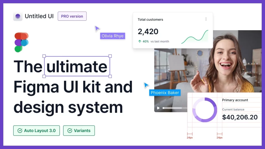
Untitled UI is a UI kit and design system made for Figma.
It was released in September 2021 by Jordan Hughes, a clearly-talented Product UX/UI Designer based in Australia.
It comes with a ton of premade components and sections you can use to design modern websites.
It also gets frequent updates, so you don’t need to worry about it becoming outdated quickly.
It claims to be the largest Figma UI kit and design system in the world – and I honestly wouldn’t doubt it.
Let’s just say it’s not the kind of file you’d want to open on your grandma’s 20-year old PC.
The UI kit includes:
🧰 Why Do You Need A UI Kit?
The purpose of a UI kit is to simplify the design process.
Rather than starting every design project from scratch, you use a framework of ready-to-use components, sections, and global styling settings.
A UI kit will have everything ranging from premade headers, hero sections, feature sections, icon boxes, testimonials, blog posts, footers and more.
It’ll also have inputs for your brand’s logos, colors & typography.
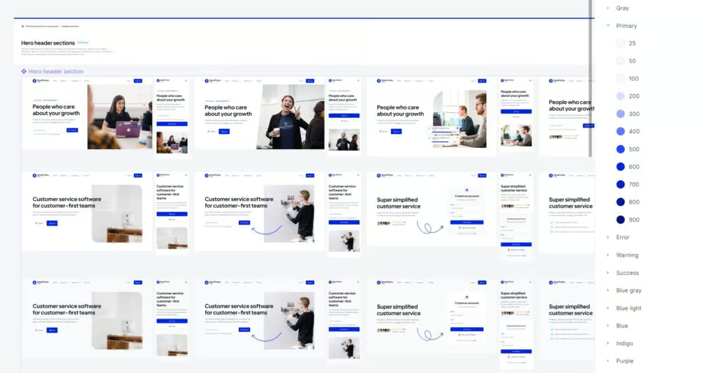
As a result, it’s easy to save hundreds of hours because you’re not designing the same components over and over again.
Since you have defined grids, fonts, colors, and shadows, all the elements throughout your design will also look more consistent with each other.
And lastly, you don’t need to stress about coming up with a nice design every time.
You can create great looking websites without needing to get ultra-creative or finding that perfect moment of inspiration.
🧑💻 Who Is Untitled UI For?
Untitled UI is for website & app designers that use Figma who want to produce high-quality work & reduce the time it takes to design their projects.
I want to put an emphasis on the high-quality work part, because it’s not for designers who simply want to pump something out as quickly as possible.
It’s more about creating a design framework that pays special attention to scalability and consistency.
In terms of the design aesthetic, it’s best suited for startups, SaaS, and tech companies in my opinion.
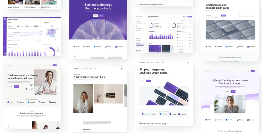
You could definitely use it for local service businesses and other projects as well, but you’d need to go a bit further in terms of customization and would probably need to create a few of your own sections.
🎮 How It Works
Getting Started
Getting set up is pretty simple. Once you’ve purchased it, you’re able to download the .fig file from their website.
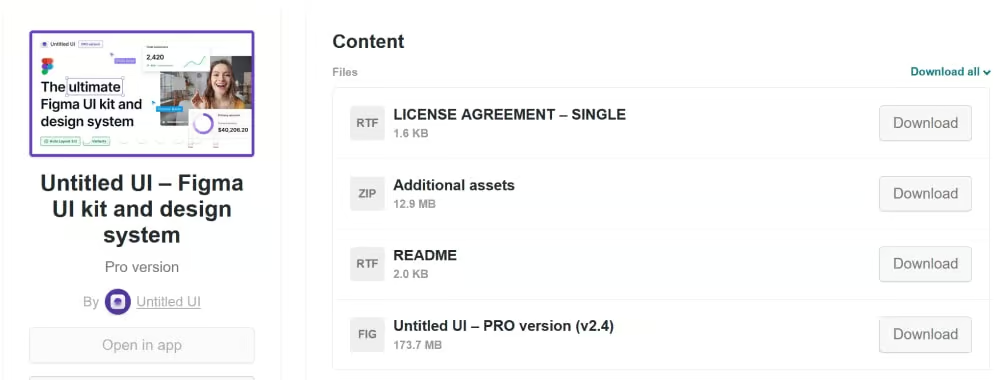
Import the file into Figma, and you’re ready to get started.
On each page, there’s a help section that explains what that page is for and how to use it.
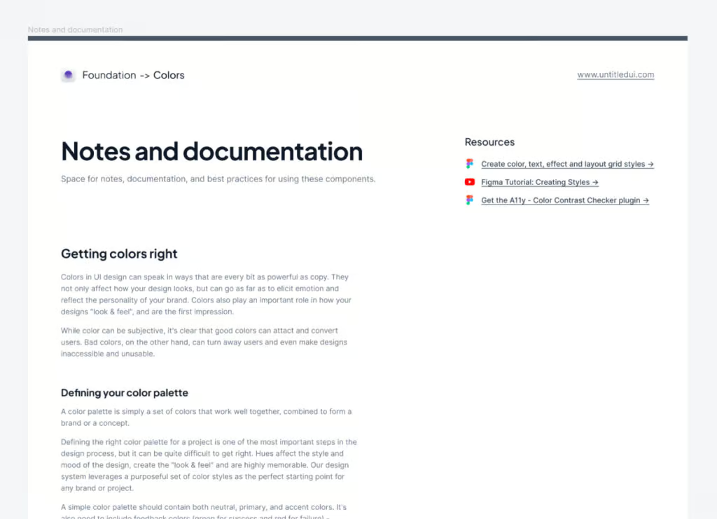
I’d recommend going through all of the pages to get a better understanding of how everything works – especially if you haven’t used a design system like this before.
Once you’ve familiarized yourself, you can start by adding your brand’s colors, logo, and fonts.
It’ll take Figma a few seconds to update all of the components, but it’s cool to see how quickly you now have elements that are on-brand and basically ready to use.
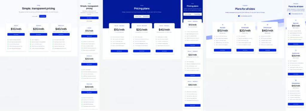
From there I usually delete everything I don’t need. I don’t want to create overwhelm or confusion, so I try to slim things down as much as possible.
For example, if you’re building a marketing website, you can probably just remove all the Application examples and components.
That should help speed the file up as well.
Feb 2022 Update: Untitled UI just released a LITE version in v2.6 that’s 50-70% lighter. At first glance I haven’t really noticed much missing compared to the full version, so it looks like they did a nice job of keeping the essentials while cutting the file size in half.
Creating Pages
It’s not immediately intuitive on how you should start building a page, so I think this is actually one area that Untitled UI could improve in a future version.
Other kits often have a blank page where you can start dragging sections into.
In any case, it only takes a couple extra seconds to create your own.
I’ve found the easiest method to be:
I usually keep this new page placed just above “MARKETING WEBSITE COMPONENTS” in the Figma navigation so that I can quickly navigate back and forth from the premade sections.
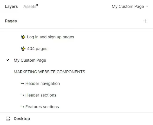
From here, the fun part begins. You can start copying sections over to create your page layout.
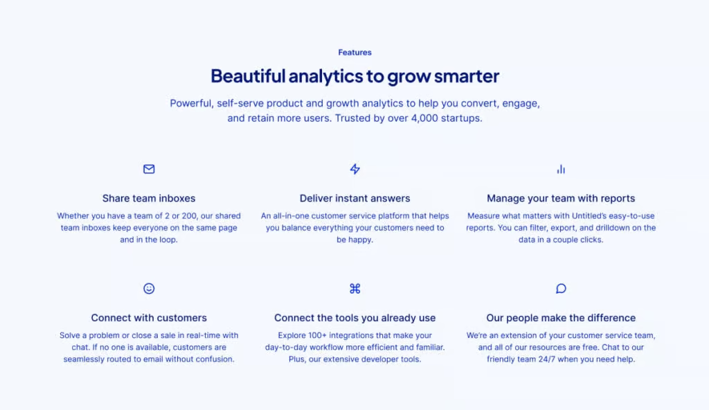
Quick tip: this UI kit utilizes Figma’s variants system. This means that rather than every component/section being independent of each other, it has multiple variations of the same component.
This is super handy, as it allows you to switch the section to a different style/layout without having to drag a whole new section in.
Once you’re happy with the layout, swap in your text and images, make any additional design tweaks you’d like to make, and export your assets.
You’re ready to start bringing your design to life in Cwicly, Elementor, Webflow or whatever tool you use to create websites 🙂
😍 What I Like Most About Untitled UI
1. It’s built really well
Like I mentioned above, this UI kit is all about creating a scalable and consistent design framework.
It makes full use of Figma’s component library, variations, auto layout, and global styling features.
Spacing is consistent, and all the layers are titled appropriately which is always a plus.
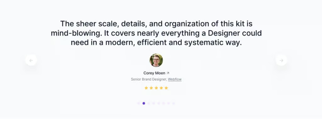
It doesn’t surprise me to see that designers from companies like Google, Spotify, Webflow, and Mailchimp have all left testimonials on the Untitled UI website.
2. There are a ton of components
Are you going to find every possible layout in here? No. And you’re still going to have to create some yourself.
But there is a lot in here – especially compared to other UI kits that I’ve tried out.
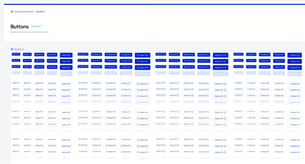
It has different sections for headers, heroes, features, pricing, CTAs, newsletter CTAs, metrics, quotes, social proof, blog archives, blog posts, contact, careers, FAQ, footers and banners.
And within those, it often has a light, dark, and colored version.
Like your buttons with the icon at the front? Or at the end? Or no icon at all?
Great, it has them all.
3. Beautiful, universal design
It’s hard to strike the right balance between offering an unopinionated design while not being bland.
I want it simple enough that I can still make it look like my design, but not so lo-fi that I’m not sure where to go with it.
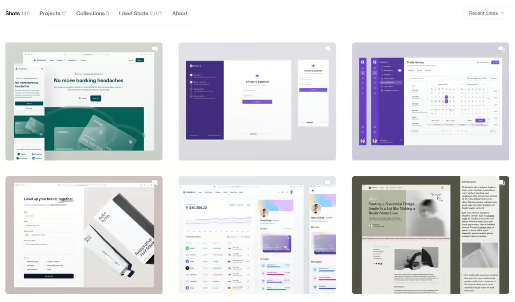
Untitled UI does a great job of this.
If you want to customize the look and feel, there is plenty of room left for flexibility.
At the same time, you could almost use the sections as-is and still have it look top notch.
Jordan actually does a good job a highlighting this by posting different design concepts daily to his Dribbble page.
💡 Where It Could Be Improved
Honestly, I don’t have much to say here.
This UI kit checks a lot of boxes.
The only thing I’ll mention is that despite all my high praise, you shouldn’t expect this to be a magical cure for all your future website builds.
It will always be difficult to find a UI kit that perfectly fits all of your needs.
If you’re building a website for a local restaurant for example, you can still absolutely use the framework and prebuilt layouts, but it will take more creativity & effort to get the aesthetic you’re looking for.
In an ideal world, I would obviously love to see more sections that fit a greater variety of websites.
But that almost seems like a crazy ask given how many sections there already currently are, and a local restaurant website likely isn’t the intended use case.
✍️ BONUS: Untitled UI Icons
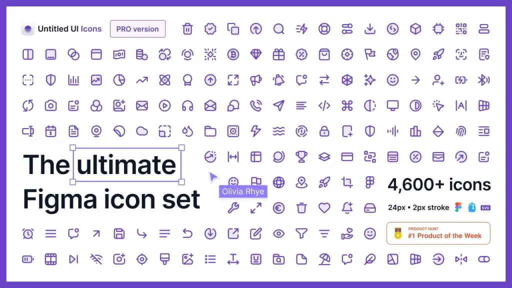
As if the 10,000 components weren’t enough, Untitled UI just released an icon pack of 4,600+ essential Figma UI icons.
It’s a clean, modern icon library that’s built to be customizable.
There are a few variations available: Line, Duocolor, Duotone, & Solid, and you have full control over stroke weights and corner rounding.
The entire line icon set comes included for free as the default icons in the UI kit, or you can purchase the Untitled UI icon library separately here.
💵 Pricing
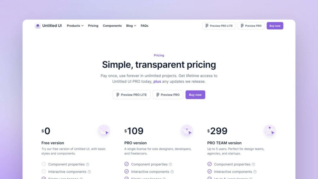
Here’s Untitled UI’s current pricing structure:
Given that it provides a positive ROI even if it were to only save you 1-2 hours, I think that’s a great value.
👉 Untitled UI Coupon Code
Want an even better ROI?
Jordan has agreed to give the NewPulse Labs community an Untitled UI discount code, where you can get 20% off your purchase 👀.
Just use this link and enter our exclusive coupon code at checkout.
🔥 Do I Recommend Untitled UI?
This one’s easy: yes.
Especially if you’re building a website for a startup, SaaS, or tech company – it’s pretty much a no-brainer.
With the sheer amount of components that are available and the attention to detail that has gone into each, it will save you an insane amount of time.
Even if you have a complex project and need more, Untitled UI is great foundation to build upon.
☁️ How to Download It
You can pick up the latest version of Untitled UI here.
Using that link, you can also get the 20% discount applied at checkout.
If you’d like to try it before you buy it, there is a free version you can download.
It’s essentially a cut back version of the full thing. If you think the UI kit might save you a couple of hours, it’s definitely worth it to upgrade to the Pro version.
Grab Your Copy of Untitled UI
That’s all for this one.
Hopefully you found this review helpful, and let me know in the comment section below if you ever decide to try this UI kit out.
Thanks for reading!


