Looking for a site builder that lets you create and publish beautiful websites without getting bogged down in code? In this review, we’re going to uncover if Framer is the game-changer you’ve been waiting for.
Since the beginning of time, there’s always been a distinction of roles between designers and developers.
Designers make the layout and developers bring it to life.
It’s a dynamic duo, but it’s also left some designers feeling like they’re missing out on the partay.
They want to be able to bring their own projects to life.
Not sitting idle on an infinite Figma canvas.
The issue has been that writing code is a whoooole different ball game than crafting digital art.
Choosing the right color palette most definitely lights up a different part of your brain than trying to figure out why a div is overflowing.
The rise of visual builders
Over the last couple years, we’ve seen the rise of visual site builders like Webflow and Etch (for WordPress) – which quite honestly have been a godsend.
They’re fantastic tools that allow you to create code visually.
They let you build fully custom sites without relying on existing themes & templates.
But now there’s a new platform for designers that aims to take things even one step further.
Introducing Framer – a design and publishing platform that that lets you design and publish live sites without ever touching a single line of code.
At least that’s what they’re claiming.
In this review, we’ll take a closer look at what Framer is, how it works, and whether it lives up to the hype of making web design a breeze for those who’d rather push pixels.
Let’s dive in!
Important Note: If you’re like me, you hate reading long reviews just to be directed to some affiliate product that doesn’t actually solve your problems. I’ve personally tested Framer, and this review is in no way sponsored or paid for by the product creator. These are my honest thoughts. That being said, some links may be affiliate links, and I may receive a commission should you want to buy the product. There’s no extra cost for you – it’s just a little way you can help support us. You can read about our affiliate promise here.
🎨 What is Framer?
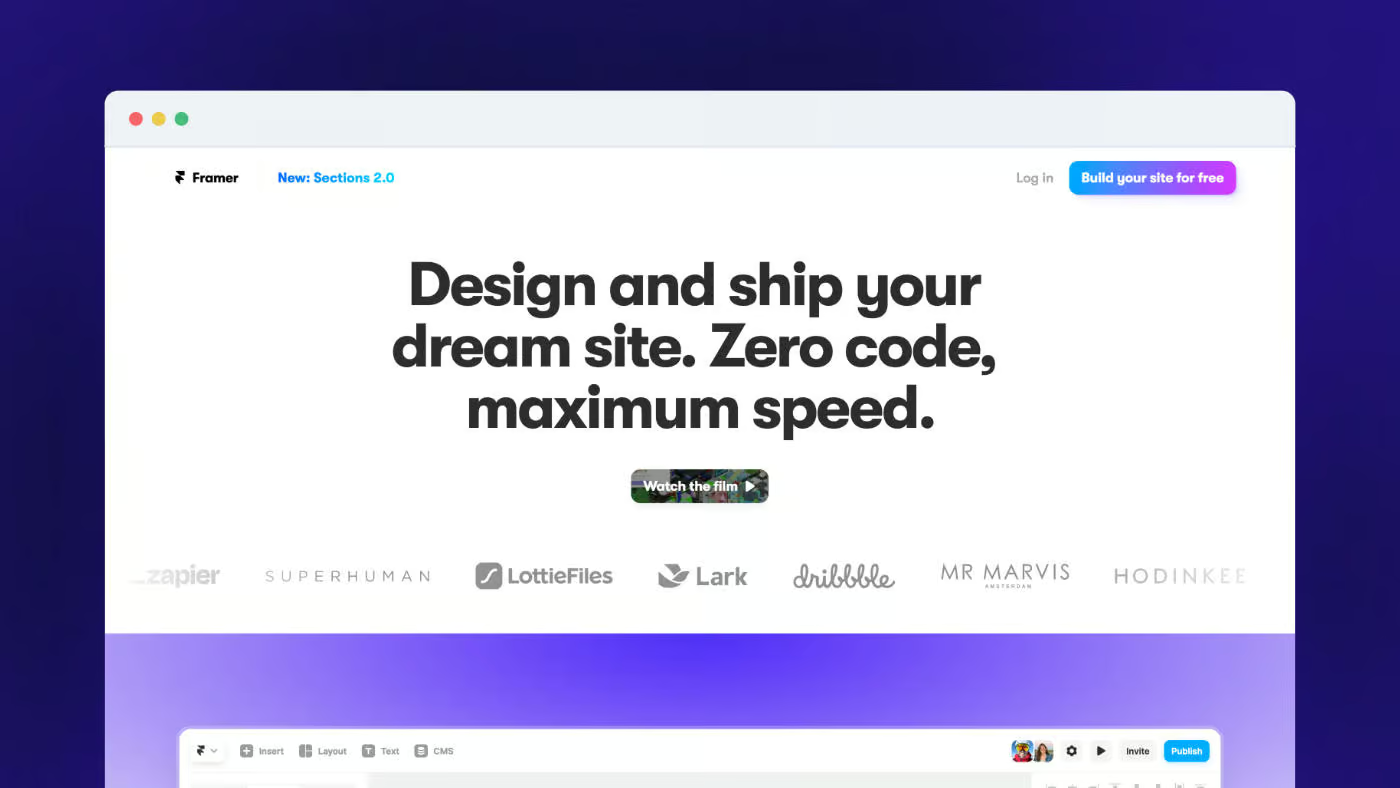
Framer is a design and site-building platform that aims to bridge the gap between designers and developers.
It lets designers create top tier websites without any coding chops.
Designers no longer need to rely on developers to turn their visions into reality.
If you’ve been a designer for a while, you might actually remember it being called Framer X.
Framer originally started as a prototyping tool, but much like other prototyping platforms (looking at you, Invision Studio), lost its appeal as Figma continued to flex its muscles.
Instead of resting on its foundation (Framer, construction joke, get it?), Framer has now transformed into a comprehensive solution for designing, building, and publishing websites.
Because of its familiar interface and easy-to-use features, Framer is quickly gaining traction as a go-to tool for creatives who want to build websites without even thinking about code.
At its core, Framer combines the best of both worlds – the creative freedom of design tools like Figma and the functionality of visual builders like Webflow.
This allows designers to focus on what they do best – crafting visually stunning layouts and user experiences – while handling the technical aspects behind the scenes.
🧑💻 Who is Framer for?
Framer works especially well for:
🎮 How Framer Works
Getting Started With Your Design
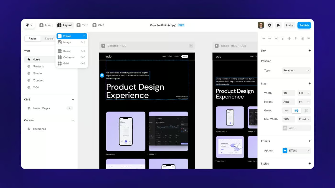
Framer carries over a lot of the core design features from Figma.
You can add text, frames, images etc.
While you can definitely create original designs inside of Framer, I do still think most people are going to create their designs in Figma and then use the official Figma to HTML with Framer plugin to import things over.
If you’re creating complex designs, Figma has more design features and allows for more fine-tuning.
From my tests, the Figma to Framer plugin actually works quite well.
There’s usually only a couple elements that didn’t import 1:1 and need minor tweaks.
The plugin is a HUGE factor in the overall user experience, and I’d say Framer did well here.
It’s almost a weird feeling to see your design available as a website with just a click of a button.
Adjusting for Mobile Responsiveness
Don’t get too excited just yet though.
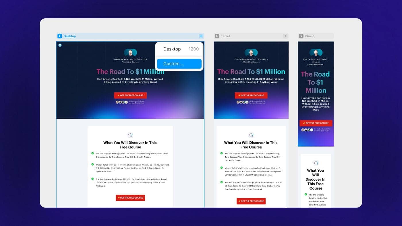
Once you preview your site for the first time, you’ll realize that getting your page to look good on different screen sizes is where most of your work ahead lies.
Depending on how well you setup your layers and constraints in the original design file, this can take a good amount of tinkering.
You may need to go through each layer and make sure it sizes fluidly based on the content or container dimensions.
I found this to be a little cumbersome at first, but once I got the hang of how things worked, it wasn’t too bad.
(“Fill” and “Fit Content” are the only two words you’ll be dreaming of the first night).
You’ll save yourself a lot of time if your design file has a clean structure and uses auto layout as much as possible.
Viewing all Breakpoints at Once
A unique feature to Framer is that because you’re working on a canvas, you can zoom out and see all breakpoints at once.
This is an awesome experience.
It lets you see how your changes are being reflected across different screen sizes, without having to switch back and forth between breakpoints.
Creating Interactions
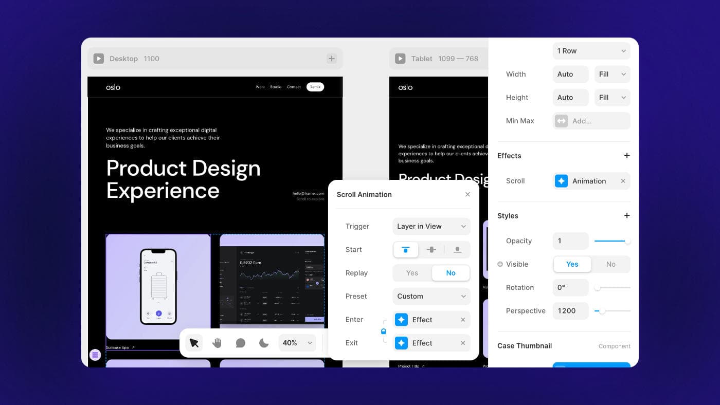
If you want to add some digital spice to your site, Framer makes it really easy to create fun interactions.
You can create different animations based on interacting with an object or while scrolling.
Creating a CMS Collection
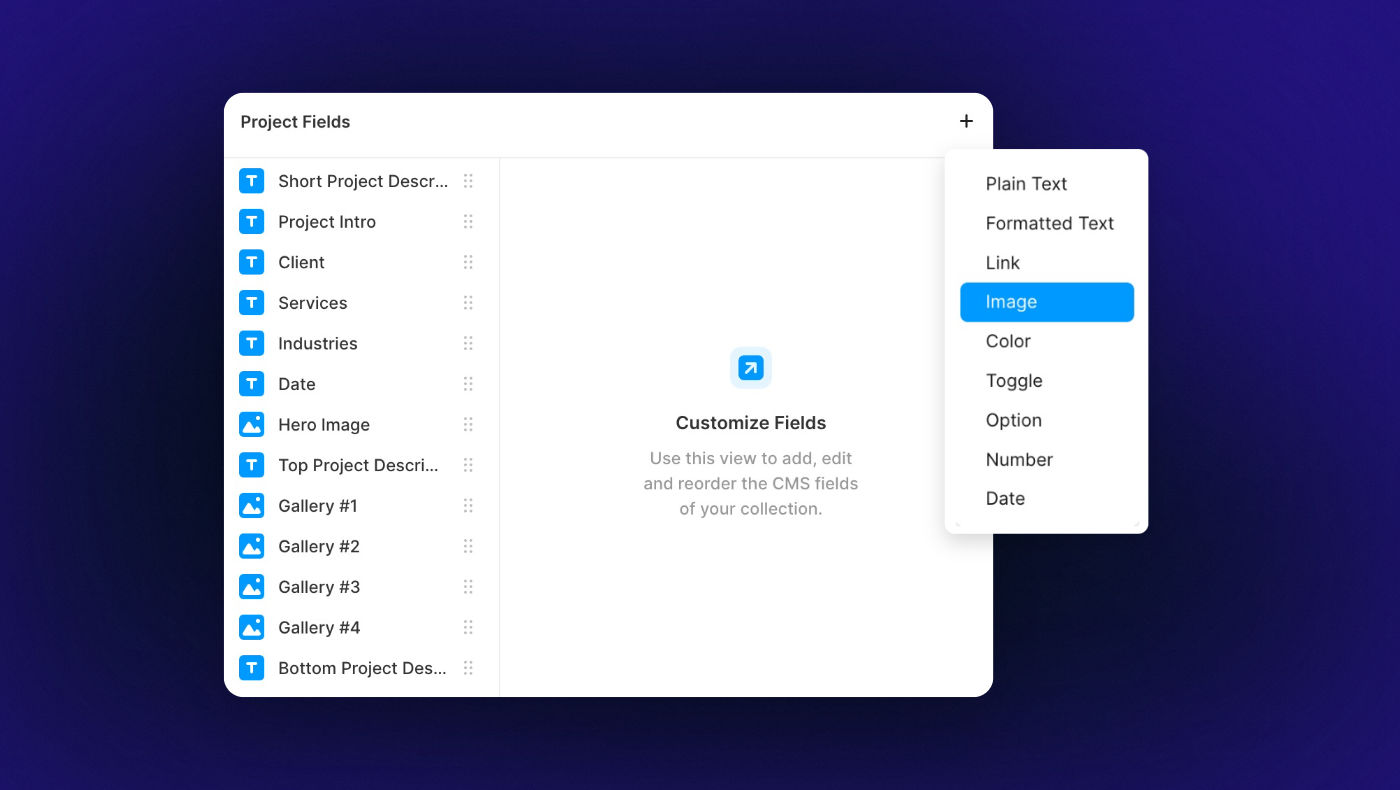
Framer comes with a simple CMS.
This lets you add blog posts, portfolio items, products etc. – and use a template to display them across your site.
For each collection, you’re able to add a variety of custom fields.
Publishing Your Site
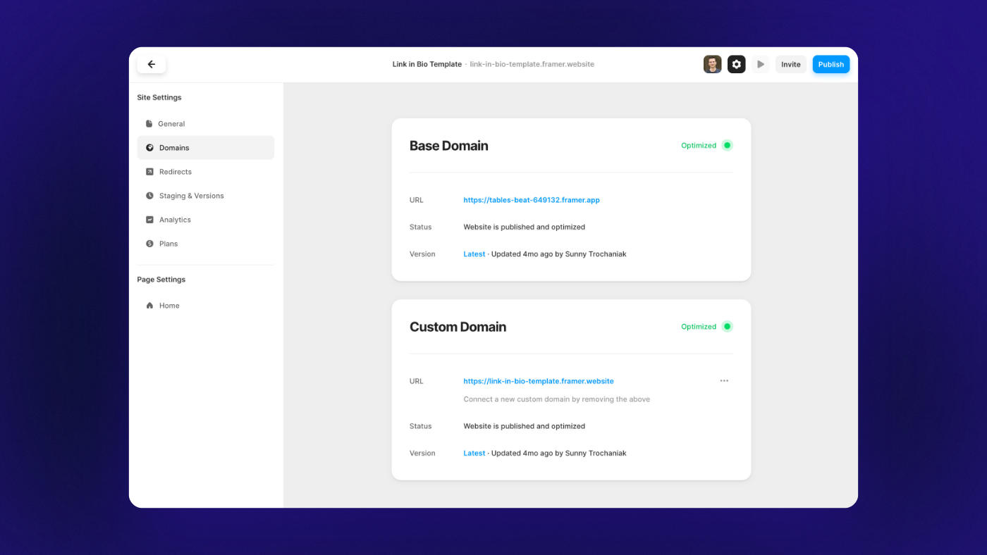
Once you’ve got everything good to go, you’re ready to hit publish.
Framer will give you a temporary domain you can quickly see your site on, but you can of course hook it up to a custom domain when you’re on one of the paid plans.
🧩 Integrations
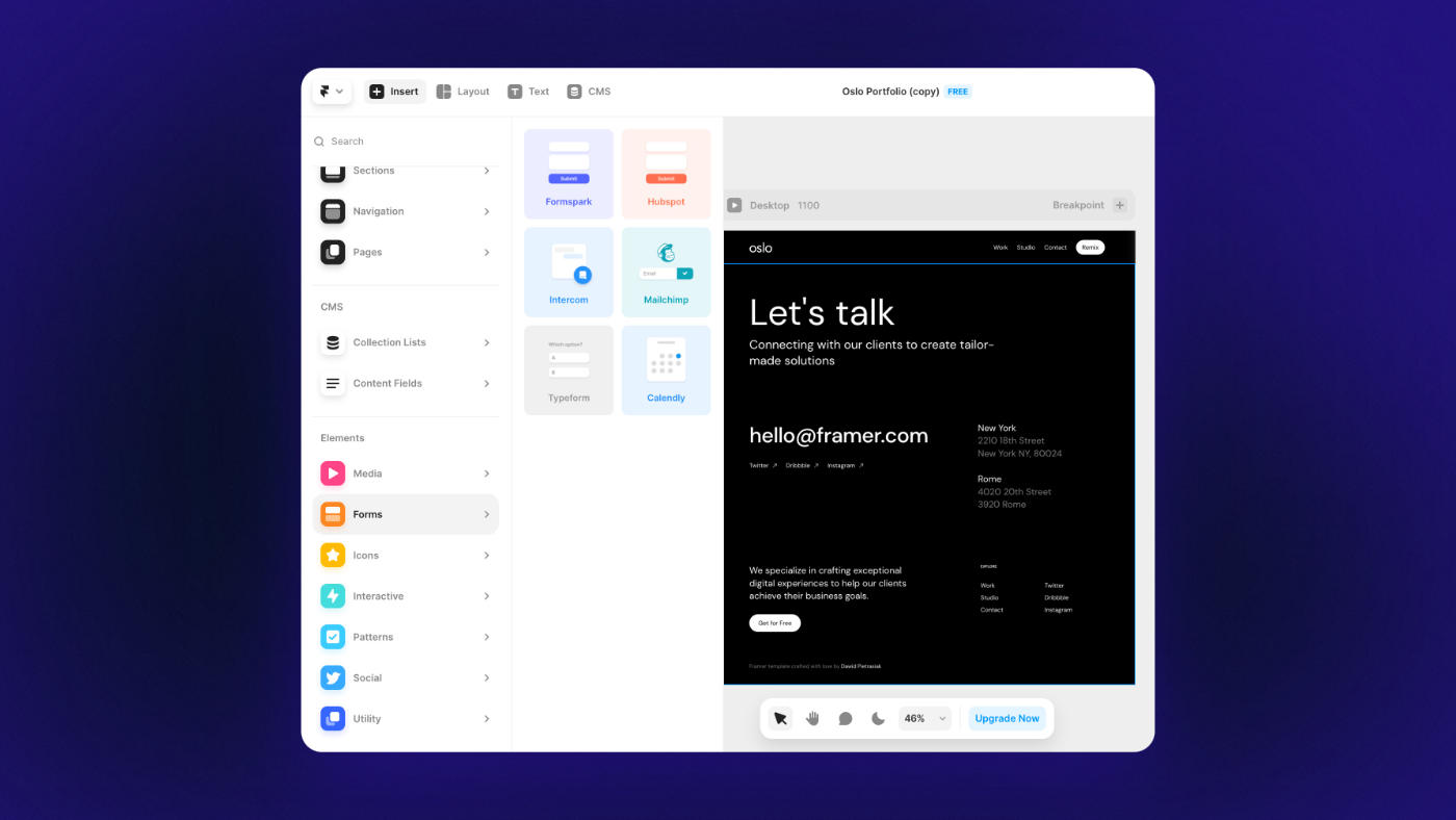
Framer has a small, but growing library of integrations.
You can easily embed essentials like:
If you want to take things one step further, you do have the ability to create new React components.
For example, here’s a user who created a custom dashboard in Framer using data fed by Airtable.
This of course brings coding knowledge back into the equation, but it’s good to know that advanced integrations are at least possible.
Integrations an area I’d like to see further developed over the coming months.
Most pressingly, there currently isn’t a native form builder.
You need one use one of their integrations or embed a form from your email marketing service.
It’d be nice if you could build a custom form and easily hook it up your email marketing service without needing a separate Typeform or Zapier subscription.
🚲 Ease of Use
Ease of use is Framer’s middle name.
If all you know is Figma, Framer will feel like home.
Seriously, it’s like 80% similar.
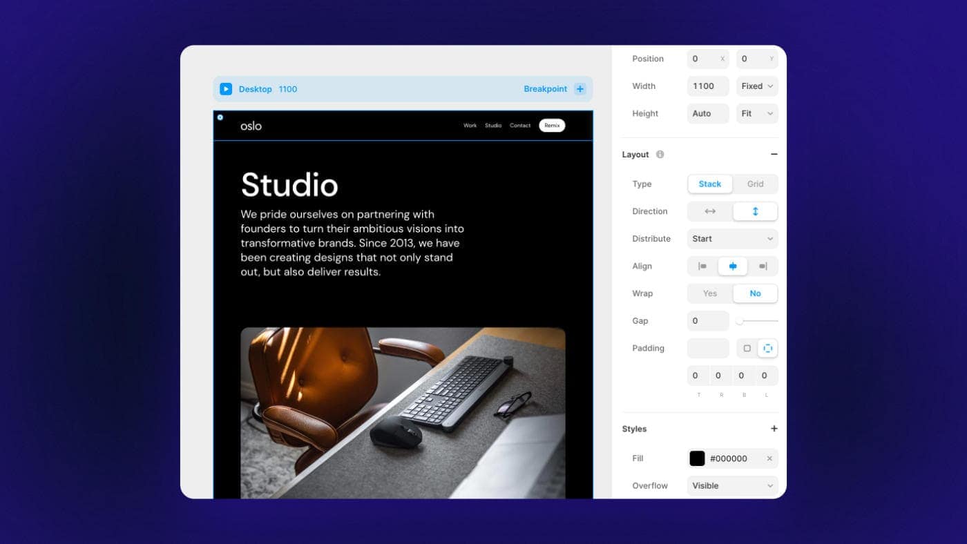
You create your rows and columns (also known as Stacks) the same way you would setup Auto Layout.
You have global styles for stuff like colors and typography.
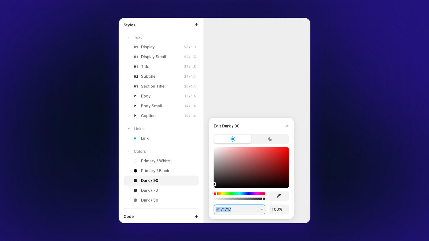
You use components & variations for elements that you want consistently styled throughout your site.
Most of the learning curve comes from doing tasks you wouldn’t normally do as much in Figma – like creating advanced animations, setting dynamic content, or making responsive tweaks.
🚀 Site Speed & Performance
First let’s talk about HTML output.
When I first tested the Framer Sites beta back in the summer of 2022, Framer suffered from quite a bit of divception.
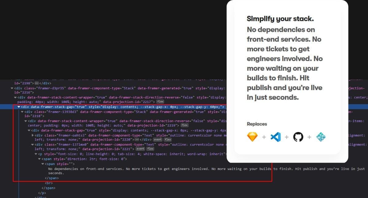
Aka: a div within a div within a div within a div…
It looks like they’ve improved that a bit over the past few months.
It’s still not the same level of clean code output you’d get with something like Webflow, but it’s not terrible either.
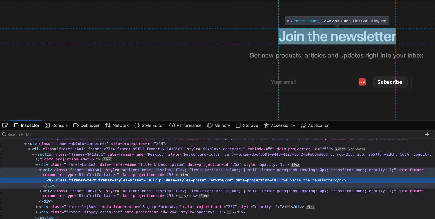
For example, an h2 element comes with the heading and one wrapper.
Images comes with 2-3 wrappers.
Not 100% ideal, but it’s a fair trade-off for getting a point-and-click web editor in return.
As far as actual page speed goes, I’ve found sites built with Framer always feel especially snappy.
Because every site is hosted with Framer, you don’t need to worry about choosing your own server specs.
They do a lot on their end to make sure your site loads fast too:
You can read more about their hosting here.
Here’s the PageSpeed score for this rather typical agency landing page:
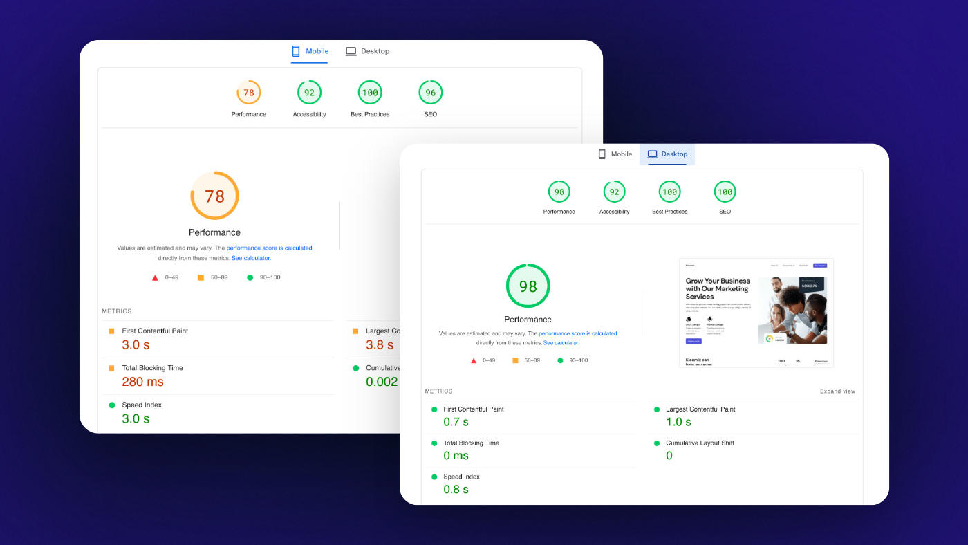
Overall, DOM output could be better, but you’re still getting blazing fast speeds so it doesn’t really matter.
🔍 Search Engine Optimization
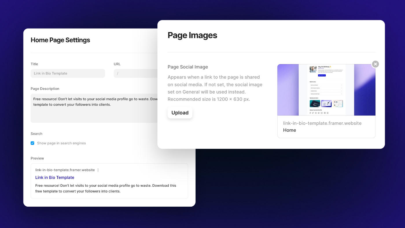
Framer comes with all the essential SEO controls.
You can easily set your page titles, permalinks, meta descriptions, alt tags, social share images etc.
If you want to implement structured data (schema), it allows you to paste custom code within your <head> and <body> tags.
This isn’t as easy as using a plugin like Rank Math for WordPress, but again, good to know it’s possible.
If you’re not concerned with schema, then I’d say Framer checks all the boxes.
And as a reminder: the quality of content on your page is always what’s most important for SEO.
🧱 Templates
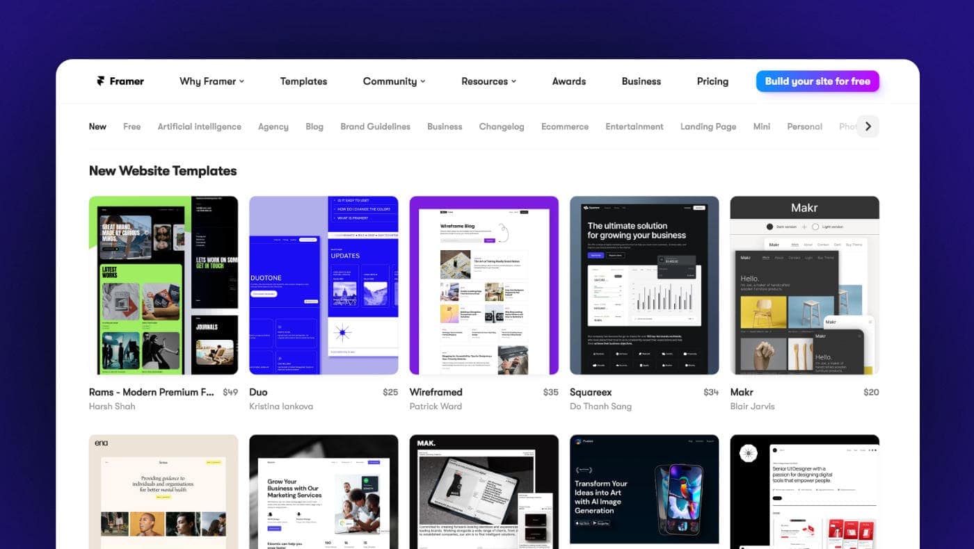
Major, major W here.
When your product is geared towards designers, you get the benefit of a community that builds beautifully designed templates.
New templates are getting added every day, and they all seem to be held at a high standard.
The templates are part of what make Framer so appealing – especially if you’re a founder/marketer or don’t consider yourself a rockstar designer.
If you can find a template you like, you can go from zero to having a legit professional website in literally 2 minutes.
🙋♂️ Community
Another big win here.
I normally stick to WordPress-related content, but I’ve seen so many talented creatives talking about Framer on Twitter that I had to try it out.
You can find cool tutorials like this:

Or this:

They also have an official Discord community that’s very active.
💡 Areas of Improvement
Of course, no platform is ever perfect.
Here are a few things I think Framer could improve as it continues to grow.
1) More integrations
I touched on this a few sections above, but more integrations or advanced native components would really unlock Framer’s potential.
It’d let you build more than just a standard brochure site or simple blog.
2) Easier code overrides
When you don’t have access to a property within the UI, Framer recommends using a code override.
All of a sudden, ‘no-code’ goes out the window. You need to start learning how React components work.
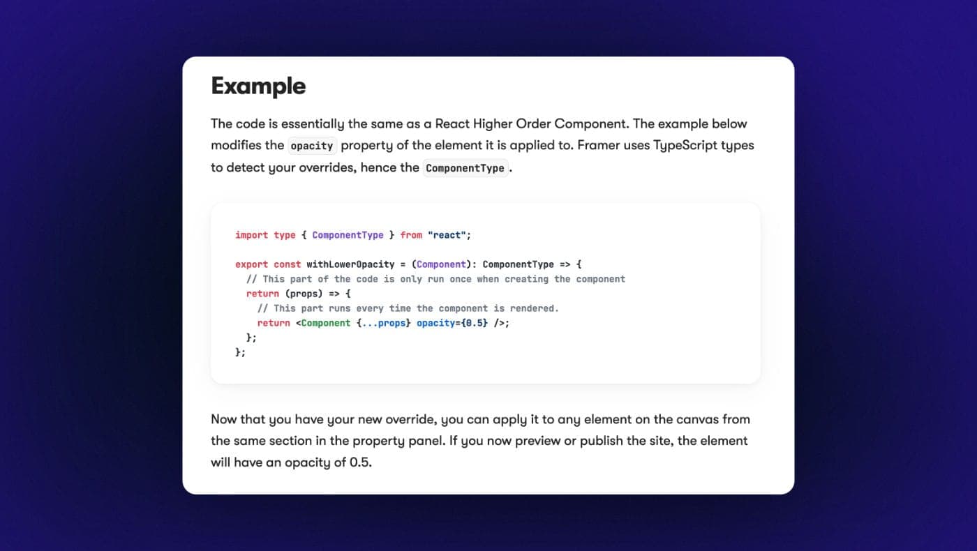
I’d like to see more advanced controls accessible through the UI – even if they’re hidden.
It’d also be nice if you could just easily apply custom CSS instead of going through the process of setting up a code override.
3) Ability to set margins
You currently aren’t able to set margins using the Framer UI.
You can sometimes get around this with gaps and padding, but for the times you need margin, they recommend using a spacer frame (spacer frames are never good!).
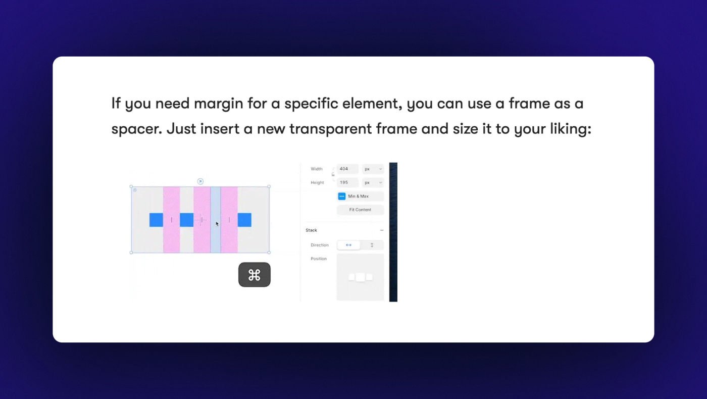
For negative margins, you need to add a code override.
4) More global styling
Global typography/color styles and components help with keeping a consistent look across your site.
Framer could take this one step further by introducing CSS classes or global styling for more elements.
Ex: it’d be nice if you could choose S, M, L, XL paddings on your sections.
🔥 Do I Recommend Framer?
Having followed Framer’s progress for a few years now and spending a good chunk of time in the editor, I think the answer is pretty clear.
Yes, I would definitely recommend Framer.
Don’t get me wrong, it has its trade-offs.
You don’t have the same level of advanced functionality as you do with Webflow or Etch (I wouldn’t build a complex membership site with Framer).
But if you’re a designer who’d prefer to stay away from code…
Or you’re a marketer and speed of implementation is important to you…
Or you’re a freelancer/agency building landing pages, portfolios, and small business sites for your clients…
Heck ya.
It’s REALLY good.
It feels like magic when you’re able to go from Figma to a live site 15 min later (or just skip Figma altogether).
And there’s something refreshing about not having to worry about setting up your div structure and naming your classes.
Or switching back and forth from your site builder to your design file trying to remember how much padding to set for your icon box.
Framer makes it so easy to get a nice page up quickly.
And it’s even better if you’re able to take advantage of one of the hundreds of templates that are quickly becoming available.
💵 Pricing
Framer has three different pricing tiers:
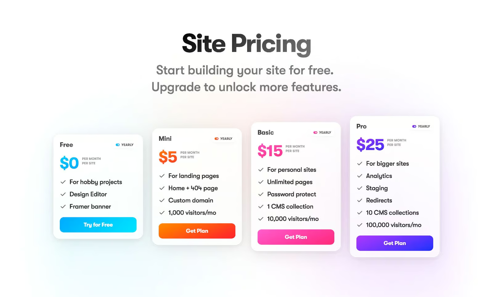
There’s also an addon to purchase more editors for your team workspace.
Overall I think it’s a good value.
The monthly costs are similar to what you would pay for a Managed WordPress host – and you don’t need to pay for any additional plugins.
It compares closely with Webflow as well.
Where it can start to get more expensive is if you’re an agency and start scale up the number of sites.
There’s no bulk pricing, so you’re going to pay the full price for every new site you add.
🔖 Framer Promo Code
As a Framer partner, I’m able to get you 25% off your first year of the Pro plan (3 months free).
All you need to do is use this link.
(You can read more about this deal here).
⚖️ Framer vs. Webflow
I see this question come up a lot.
Which builder should you use? Framer or Webflow?
I actually think the answer is pretty simple: it depends on the project.
I wouldn’t call either builder better than the other.
You can think of it like taking pictures with an iPhone (Framer) or a DSLR camera (Webflow).
The DSLR will give you the best photos, you can use different lenses, and you can manipulate them in Lightroom in a thousand different ways.
But it comes at the cost of being heavier to carry around, and more work to get that finished photo.
The iPhone will give you very good photos instantly, and you already carry it in your pocket.
But it comes at the cost of not being as high resolution, not having as much background blur etc.
That’s why you bring a professional camera to your engagement photos, and your phone to more casual outings.
You can use this concept when thinking about the specific website you’re building.
What would be more suitable for this website? An iPhone or DSLR camera?
☁️ How to Sign Up for Framer
You can sign up for Framer for free on their website if you want to play around with the editor.
If you want to hop on one of the Pro plans, you can simply upgrade from your dashboard.
Start Using Framer
That’s all for this one.
Hopefully you found this Framer review helpful, and be sure to let me know in the comments section below if you ever decide to try it out.
Thanks for reading!


