

One of the great things about flexbox is just how… flexible it is.
However if you’re designing your sections as you go or using your own ‘mental layout system’, it can quickly lead to spacing consistency issues across your site.
This is particularly true if you’re making changes to your site a while after it was initially built – where the methods you used are no longer fresh in your head.
You find yourself looking back to see what percentages you used, what you did for paddings & margins, what class names you used etc.
It becomes difficult to get your columns to align properly.
Enter Bootstrap…
One of the best ways to standardize your layouts is to use a pre-established layout system like Bootstrap.
Bootstrap actually itself extends much further than just layouts, with predefined styling for buttons, lists, forms & much more, but for the sake of integrating with Oxygen Builder, its layout system is the most interesting.
We’re moreso looking for layout consistency as opposed to component styling – which is already super easy in Oxygen.
Oxygen Builder and Bootstrap Work Well Together… But Aren’t a Perfect Match
Both Oxygen and Bootstrap v4 use a flexbox-based layout engine, which simplifies a lot for us.
The two have conflicting approaches to mobile responsiveness though. Oxygen is built desktop-first, while Bootstrap is mobile-first.
This means that in Oxygen, whatever styling you apply for desktops cascades down to mobile devices. Whereas in Bootstrap, whatever styling you set for mobile devices carries itself up towards desktops.
Fortunately this doesn’t create too many issues for us, but it’s definitely something to keep in mind whenever using Bootstrap’s classes.
Step 1 – Add Bootstrap’s CSS to Oxygen
Bootstrap comes with a lottttttt of default CSS. Since we’re only using it for its grid, we can cut most of it out.
It also uses different breakpoints than Oxygen, so we’ll need to modify them to make sure things line up.
Luckily for you, I’ve already done this for you.
The CSS is still too long for this page, so you can access it by clicking the button below:
You’ll want to copy all of that code into a new Oxygen stylesheet.
In the Oxygen builder, click Manage (top right) > Stylesheets > Add Stylesheet > name it “Bootstrap” > paste the code > hit Save.
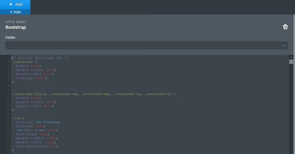
*Important: the CSS file is using Oxygen’s default 480px, 768px, 992px, and 1120px breakpoints. If you have modified any of these in your Global Settings, do a Search > Replace to use your own values instead.
Step 2 – Start Using Bootstrap in Your Sections
If you’re not familiar with how Bootstrap works, it’s worth going through their documentation to get a better understanding.
There are a couple key concepts that will probably make everything a lot clearer for you.
1) Section Div Structure
Bootstrap sections follow this structure:
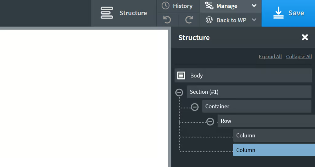
You can actually often get away with just using the Row and Columns. A container will be necessary though if the content in your columns isn’t enough to have the row span 100% of its width.
2) Column Width and Responsiveness
Columns use a class that follow the format of: col-breakpoint-size. I’ll explain breakpoints and sizes below.
Breakpoints
With our modified stylesheet, each Bootstrap breakpoint matches up with those in the Oxygen editor. So you can think of it as:
xl = All Devices (> 1120px)
l = Page Container (1120px and below)
md = Tablet Landscape (Less than 992px)
s = Tablet (Less than 768px)
xs = Mobile (Less than 480px)
Sizes
A column size can be between 1 and 12. If it’s 12, it will span 100% of the row. If it’s less, it will only span a fraction of the row.
Putting It All Together
You can assign different sizes based on different breakpoints. (And don’t forget, the sizes carry upwards towards larger screens).
Let’s run through a couple examples:
If you want a row that has 50/50 columns, but stacks on devices less than 768px, you’d give both the columns a class of “.col-md-6”.
If you want a row that has 75/25 columns, but stacks on devices less than 768px, you’d give the first column a class of “.col-md-8” and the second column a class of “.col-md-4”.
If you want a row that has 75/25 columns on desktops, but moves down to 50/50 on laptops, and stacks on devices less than 768px, you’d give the first column the classes “.col-xl-8 .col-md-6” and the second column the classes “.col-xl-4 .col-md-6”.
Using Bootstrap’s Modifier Classes
Bootstrap has quite a few modifider classes built-in that allow you to manipulate your layout further.
For example, you can set offsets on columns, set custom paddings & margins, and control most of the flex alignment.
Again, it’s a good idea to go through the CSS and their documentation to become more familiar with this.
Bonus: Using Your Own Custom Modifier Classes
As you start using it more, you might want to start manipulating Bootstrap a bit to improve your workflow further.
To give you an idea, you can:
Which is exactly what I’ve done with my custom CSS below.
I probably wouldn’t advise copying it letter for letter, as it hasn’t been tested thoroughly, and my gutters/margins are completely arbitrary.
You can definitely use it as inspiration or as a starting point for creating something similar on your site though.
/* Custom Bootstrap Helpers */

/*Microthemer Bootstrap Compatibility Fix */
body[class*="mt-"] {
	margin-top: 0 !important;
}

/* No gutters between columns - applied to row */
.no-gutters>[class*="-col"] {
	padding-right: 0;
	padding-left: 0;
}

/* Various gutter sizes - applied to row */
.gutters-1 {
	margin-right: -10px;
	margin-left: -10px;
}

.gutters-1>[class*="col-"] {
	padding-right: 10px;
	padding-left: 10px;
}

.gutters-2 {
	margin-right: -15px;
	margin-left: -15px;
}

.gutters-2>[class*="col-"] {
	padding-right: 15px;
	padding-left: 15px;
}

.gutters-3 {
	margin-right: -30px !important;
	margin-left: -30px !important;
}

.gutters-3>[class*="col-"] {
	padding-right: 30px !important;
	padding-left: 30px !important;
}

.gutters-4 {
	margin-right: calc(-4% / .92) !important;
	margin-left: calc(-4% / .92) !important;
}

.gutters-4>[class*="col-"] {
	padding-right: 4% !important;
	padding-left: 4% !important;
}

.gutters-5 {
	margin-right: calc(-5% / .9) !important;
	margin-left: calc(-5% / .9) !important;
}

.gutters-5>[class*="col-"] {
	padding-right: 5% !important;
	padding-left: 5% !important;
}

/* Disable the gutters on mobile devices (since columns stack) */
@media (max-width: 767px) {
	.gutters-1,
	.gutters-2,
	.gutters-3,
	.gutters-4,
	.gutters-5 {
		margin-right: 0 !important;
		margin-left: 0 !important;
	}
	.gutters-1>[class*="col-"],
	.gutters-2>[class*="col-"],
	.gutters-3>[class*="col-"],
	.gutters-4>[class*="col-"],
	.gutters-5>[class*="col-"] {
		padding-right: 0 !important;
		padding-left: 0 !important;
	}
}

@media (max-width: 767px) {
	/* Reverse columns on mobile - applied to row */
  	.row.reverse-columns-sm {
      	flex-direction: column-reverse;
  	}

	/* Automatic vertical spacing between columns on mobile */
	.row:not(.reverse-columns-sm) [class*="col-"]+[class*="col-"] {
		margin-top: 60px;
	}
	/* Automatic spacing adjusted for reversed columns */
	.row.reverse-columns-sm [class*="col-"]:first-child {
		margin-top: 60px;
	}
	/* Use smaller vertical spacing */
	.mobile-mt-1:not(.reverse-columns-sm) [class*="col-"]+[class*="col-"] {
		margin-top: 30px;
	}
	.mobile-mt-1.reverse-columns-sm [class*="col-"] {
		margin-top: 30px;
	}
	/* No automatic spacing */
	.mobile-mt-0 [class*="col-"] {
		margin-top: 0px !important;
	}
}
And that’s a wrap!
Hopefully you found this tutorial useful. I’ve used Bootstrap with Oxygen on a couple of sites now, and I have to say it does remove a lot of thinking when it comes to setting up your layouts. It’s just nice to have your columns always perfectly align.
I’d also recommend watching the video at the top of this article in case it helps clarify anything for you.
Thanks for reading!