

Editor’s note: this list has been freshly updated for 2026!
As a web designer, you know firsthand how much time and effort it takes to create a world-class website.
From planning the layout to designing each individual component, the process can be both tedious and time-consuming.
It’s even worse when you just KNOW you shouldn’t be spending all this time creating a testimonial section from scratch.
Either you’ve made it before, or you’ve seen it somewhere else.
It’d be so much easier if you could just press copy + paste on an existing layout and spend the rest of your time adding your own creative flair.
Thankfully, there are a number of Figma UI kits available that can help drastically speed up your workflow.
Whether you’re looking for pre-made components (like an icon list) or entire page templates, Figma UI kits can provide a major boost to your productivity.
But with so many UI kits available, it can be hard to know which ones are worth your time.
After all, you want to find that rock-solid resource that fits your style and you can use over and over again on every project.
That’s why I’ve compiled a list of my top 7 Figma UI kits for web designers.
I’ve personally tested each one, and will be updating this post often.
I’m focusing on quality and not quantity.
So whether you’re just getting started in web design or you’ve won an Awwward, you’ll definitely find some of these resources helpful!
*Important Note: We’ve personally tested every product mentioned in this article. Some of the links below are affiliate links, are we may receive a small cut should you want to buy the product. There’s no extra cost for you – it’s just a little way you can help support us. You can read about our affiliate promise here.
1. Untitled UI
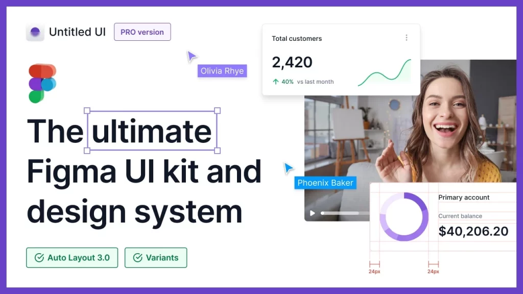
Untitled UI is one of my favorites on this list, and might be the most comprehensive UI kit for Figma available on the internet right now.
It has almost every component and section you can think of, including:
More importantly, I can’t speak highly enough of the quality.
I don’t want to know how long it took Jordan Hughes to put this kit together.
Every single component is thoughtfully put together, and there weren’t any corners that were cut.
Each section of the UI kit also comes with helpful documentation to help you utilize best practices.
I’ve actually learned a lot about Figma and scalable UI design just by going through it all.
In terms of the design aesthetic, it’s best suited for startups, SaaS, and tech companies.
It hits the sweet spot for being beautifully designed while being unopinionated enough that you can still create a completely custom look for your website.
Jordan shares different designs he’s made with the UI kit on his Dribbble account.
I like this UI kit so much that I wrote a full review of Untitled UI here (there might also be a special discount in that review 👀).
There’s a limited free version available if you’d like to test things out, or you can get all the components with the $129 Pro license.
If you think the UI kit might save you a couple of hours, it’s definitely worth the upgrade to the Pro version.
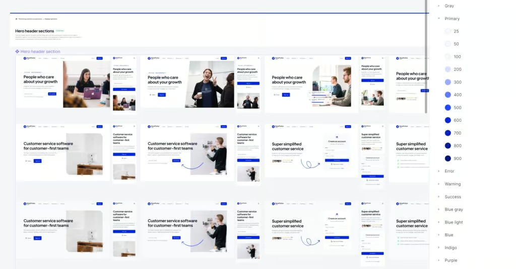
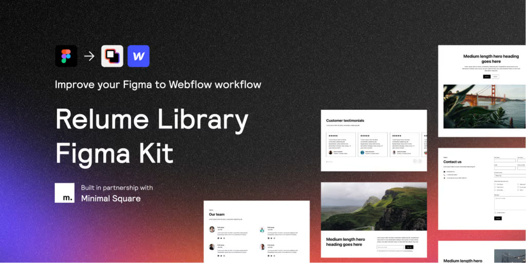
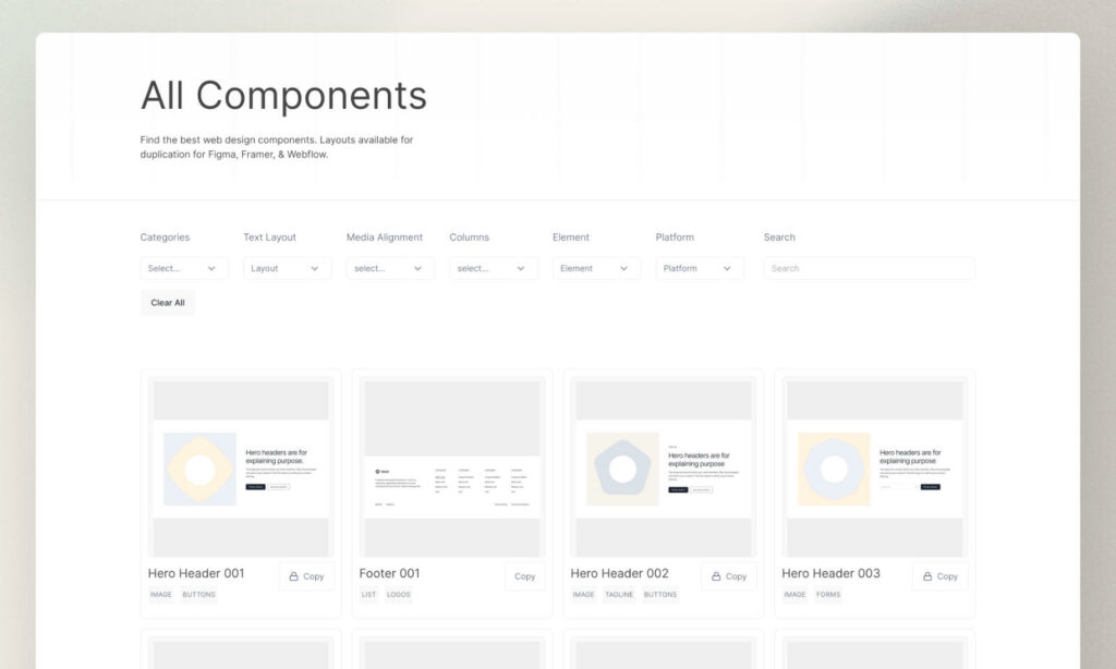
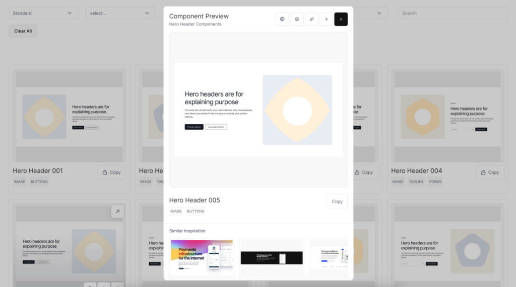
2. Relume Figma Library
The Relume Figma Kit is amazing for when you want to quickly put together page layouts.
It has hundreds of common section layouts that you can stack together like Lego.
You can mix and match different sections to create a completely unique layout for any web page.
They’ve also recently introduced “uncommon” section designs, which are meant to be more interactive and engaging (I love this).
It’s a mid-fidelity UI kit, meaning it’s completely unopinionated and can be transformed into any design style.
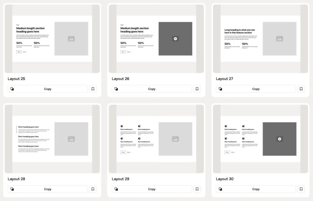
You use their base structure, and then add your typography, colors, images, and accents on top.
The Relume Figma Kit is well documented and has an engaged community – including a YouTube channel where they post tutorials and fun design challenges.
If you use Webflow, you can actually copy + paste each section you see in the UI kit straight into Webflow to speed up the development process.
You can also do this for React components.
This part does require a Relume Library monthly subscription, but the Figma UI kit file is completely free!
3. Flowbase
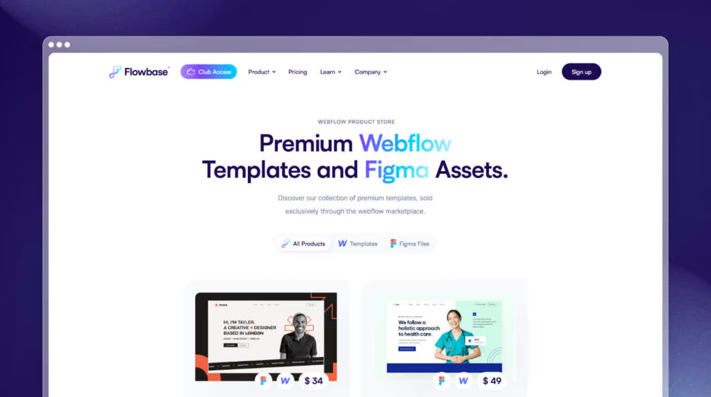
This is a slightly different entry on this list.
Rather than being one large UI kit, Flowbase has a number of different UI kits available based on what you’re looking for.
Honestly, the designs are amazing and have been a huge inspiration to us here at NewPulse Labs.
Flowbase has full site templates that provide a ready-to-go design for all your core pages (homepage, about, services, contact, pricing etc).
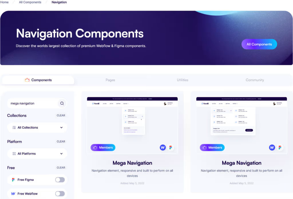
They also have individual components if you’re not looking for full site designs.
This can be particularly handy if you already have an existing website and just want to add new elements.
Ex: Let’s say you want to add a beautiful mega menu to your navigation.
You can just use one of their mega menu components and plug it right in to your design.
Flowbase also has a wireframe kit called ChalkUI.
Like Relume, it’s an unstyled UI kit that’s nicely laid out.
Flowbase provides even more value if you use Webflow or Framer. You can copy any template or component and paste it directly into your Webflow or Framer site.
Even if you don’t use either of those two builders, the design assets are still incredibly useful.
Flowbase’s pricing varies. You can purchase templates for a set price, access certain components for free, or get access to all components with their monthly membership.
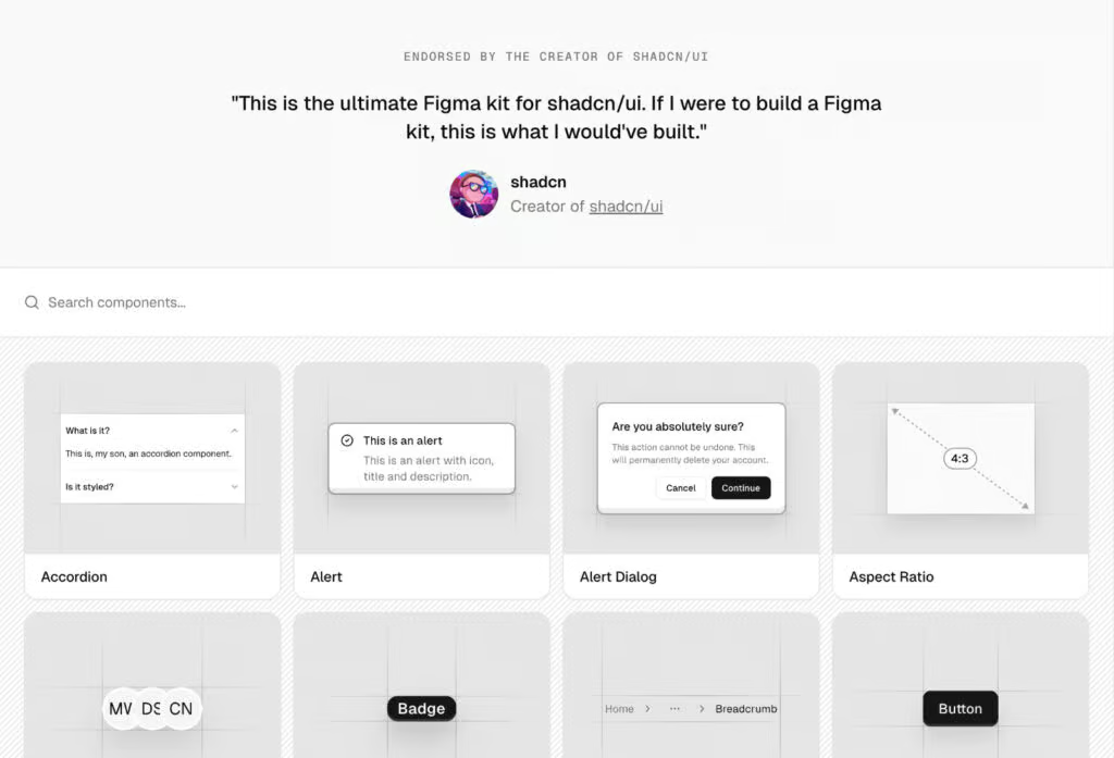
4. shadcn/ui Figma Kit
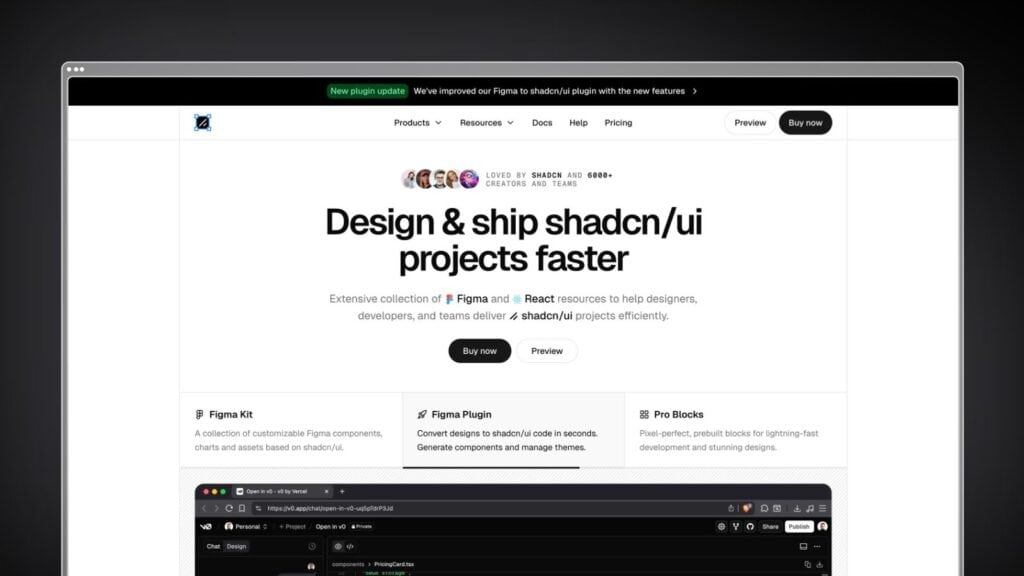
If you’re building with React and shadcn/ui, this is the Figma kit you need.
(Even if you’re not using shadcn/ui, it’s still a nice & clean UI kit).
Created by Matt Wierzbicki – who spent 7 years maintaining the popular Ant Design System – the shadcn/ui Figma Kit is specifically designed to match the shadcn/ui component library pixel-for-pixel.
What makes this particularly powerful is the tight integration between design and code:
The kit includes all the standard shadcn/ui components, plus production-ready Pro Blocks for landing pages and application UIs.
These blocks come as both Figma components and ready-to-use React code, which is a huge time-saver.
Another feature is the Figma to shadcn/ui plugin. You can select any design element and instantly generate clean, accessible shadcn/ui code with proper structure and best practices.
If you’re already using shadcn/ui in your development workflow, this kit eliminates the design-to-code gap entirely.
The kit is endorsed by shadcn himself and is listed on their Figma docs page, which speaks to its quality.
There is a free demo version, but otherwise you’ll need at least the Basic Package to get access to the Figma kit.
5. Brixies
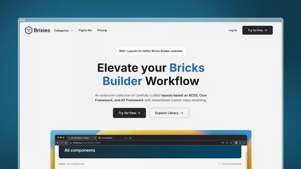
Brixies is probably the hidden gem of this list.
While it’s mostly known as being a layout library for Bricks Builder (a WordPress page builder), they’ve actually created a massive Figma kit that works great for any web designer in the process.
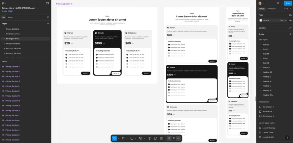
The Figma files include 800+ clean, well-organized layouts organized by section type (hero sections, CTAs, footers, pricing, etc.).
One of the areas Brixies excels at is variety. You get multiple layout options for each common section type. Not just the classic boring wireframe layouts.
They’re also adding new layouts every single week based on user requests.
If you do use WordPress with Bricks Builder, there’s the added bonus of being able to copy these layouts directly into your site with ACSS, Core Framework, or AT Framework.
But even if you don’t, the Figma files alone provide solid value as wireframing and layout inspiration (and you can import them into Framer quite easily).
Brixies offers a limited free tier with 12 layouts to test out, an annual plan for $99, or a lifetime license for $299.
6. Tilebit
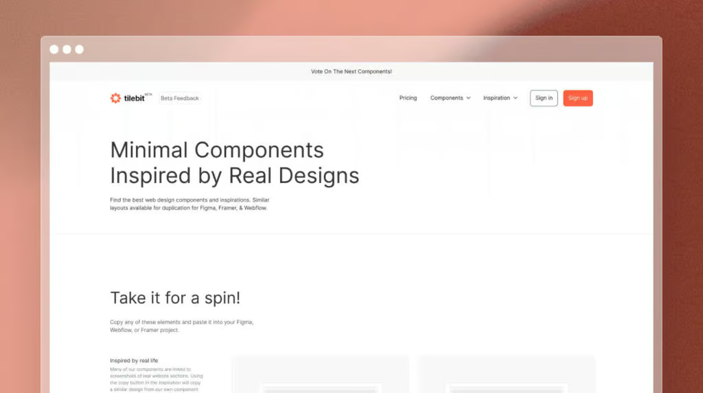
Tilebit was created by Arnau Ros (who you might recognize from YouTube) and Nicola Toledo.
Their methodology is to look at popular real life designs, break them down into a simple layout structure, and create a component out of it.
This gives you a nice starting point which you can then add your styling to.
Even though minimally-designed components help you get something on the page, one downside is that it can still be difficult to get your creative juices flowing.
Tilebit does a nice job solving this problem by attaching inspiration to most of their sections.
Not only does this give you pre-built sections to work with, it gives you some ideas on how to design them.
Super helpful!
All of Tilebit’s components are available for Figma, Webflow, and Framer.
So not only can you get a head start on your Figma design, you can also get a head start on the development.
Tilebit has a free forever plan with limited access to certain components, and a Freelance plan for $16/mth that gives you access to everything.
7. DesignKit
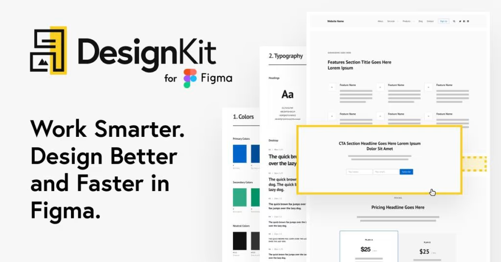
I’ve been a fan of Rafal Tomal for a few years now, and he’s built a super clean starting point for all your websites called DesignKit.
It’s essentially three resources packed into one: a wireframe kit, a web style guide, and a design starter template.
It’s well-documented, and even the kit itself is laid out really nicely.
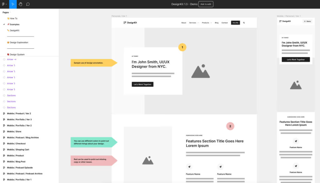
With the design system, you can set your brand assets, colors, logo, typography grid etc.
The wireframe kit is where you can pull sections from and start piecing your page together.
It’s low/mid-fidelity UI kit, so it takes care of the component structure while you apply your styling.
DesignKit is available for $99 as a one-time payment.
Where should I start?
If you have a minute, we would actually recommend checking out ALL of these UI kits first.
You might find that there’s a style, structure, or particular library of components that suits you best.
In terms of general recommendations:
Or use them all.
This is the beauty of having access to multiple great design assets.
You can pull what you need from one and pair it with another.
You might need to adjust some colors, typography, or grids, but it’s still a lot easier than creating the section from scratch.
Closing Thoughts
Hopefully you found this article on the top Figma UI kits for web designers useful!
They’re a serious game-changer that not only help you be more productive but can help take your design skills to the next level.
Better design = higher rates = better clients = a more enjoyable and profitable web design career.
Feel free to leave a comment below if you found one of these particularly useful, or if you think there’s a UI kit I should add to the list.
Thanks for reading!